Ballpark figures: Analyzing MLB baseball attendance
It is springtime in the U.S., which means something as American as apple pie is back: baseball. And since there’s all kinds of great data around one of the country’s great pastimes, we decided for this week’s post to look at Major League Baseball (MLB) attendance statistics from the last 20 years, which is published on many websites including the one we used to get the data you’ll find in the charts below: ESPN.com.

It is springtime in the U.S., which means something as American as apple pie is back: baseball. And since there’s all kinds of great data around one of the country’s great pastimes, we decided for this week’s post to look at Major League Baseball (MLB) attendance statistics from the last 20 years, which is published on many websites including the one we used to get the data you’ll find in the charts below: ESPN.com.
To collect the attendance data from ESPN, we used Jupyter Workspaces (currently in beta in Domo) and the Python package Beautiful Soup to parse the HTML. And since Domo can now schedule code in Jupyter Workspaces to run regularly, you can be sure that this page will continue to update with the 2022 data.
The first thing you’ll probably notice when looking at the data is that 2020 is missing. That’s because, due to the pandemic, baseball was played without fans that year. There was a bit of a return to normalcy in 2021, but it wasn’t until this season that all spectating restrictions were lifted, so it will be interesting to watch how attendance rebounds (though, in full transparency, we only have the data for full years right now, so we are not capturing any data related to seasonality, such as how weather or a team’s place in the playoff race affects ticket sales).
One good way to review this data is with an old favorite of many data scientists: a box and whisker plot. The chart shows the minimum and maximum average attendance for each team in the whiskers (the top and bottom lines). I have sorted this to show the team with the highest peak attendance year on the left, and the lowest on the right:
Where the visualization gets more interesting for me is with the box elements. Each box shows the space between the 25th and 75th percentiles, which is meant to reflect how much a team’s attendance has swung over the years. The bigger boxes tell me those teams (such as Philadelphia and Detroit) have had some great years for attendance and some not so great years. Smaller boxes (such as Boston) say that a team has been very consistent in its attendance numbers. We have also filtered the chart for pre-pandemic years only, because 2021—and, to a lesser extent, 2022—skews the data.
An alternative approach to understanding how teams rank in attendance is to create indexes of where a team’s attendance stands relative to the total MLB average—which is what we’ve done directly below. Dark blue boxes mean that a team is well above the average, while dark orange boxes mean that a team is well below the average. You can use the filters to look at whatever league, division, team(s), or year(s) you’re interested in:
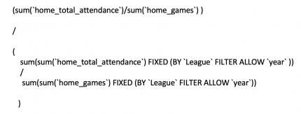
Long-time Domo users may be looking at these indexes and thinking that I did some pre-calculation in a Magic ETL or a Dataset View. It’s true that doing calculations on such total levels typically require pre-calculation. But if I did that, it would be hard to allow for the year filter. So, the secret is out: With Domo’s new FIXED beast modes (currently in beta), you can do FIXED level of detail functions right in a beast mode. For the above “Index to League Avg”, this is the calculation:

You can see there are two things happening here. First, when I have the SUM FIXED by League, then it is summing across all values with the same league as the row I am on. That allows me to get that league total we need for the denominator of the index. Second, it is using FILTER ALLOW to tell Domo that filters on Year can impact the FIXED functions. There are options for FILTER ALLOW, FILTER DENY, and FILTER NONE.
Here’s one last example of how useful the FIXED with FILTER DENY can be. The bar charts below are defaulted to the New York Yankees (my boss’ favorite team). The first chart is not using FIXED, so when I filter for the Yankees, the Min, Max, and Median fields become meaningless since they get filtered to be the same as the selected team. The second chart uses FIXED and DENY on team name so that the Min, Max, and Median remain as references to the main average, which is for the Yankees.
One of the things I love—and also at times find maddening—about exploring new data is that there is always more to explore. As I worked on this post, I realized that it would be quite interesting to bring in teams’ win/loss records as well as information on stadium capacity. But then I thought: Let’s maybe save that for a future post.
What's Your Reaction?


:quality(85):upscale()/2024/09/09/785/n/1922283/901e710666df358b373de2.40207443_.jpg?#)
:quality(85):upscale()/2024/07/23/904/n/1922283/dc92642c66a0159ee98db4.72095370_.jpg?#)
:quality(85):upscale()/2024/07/10/842/n/1922283/8fb902af668edd399936b2.17277875_.jpg?#)
:quality(85):upscale()/2024/06/07/909/n/1922283/82a389f8666372643f2065.06111128_.jpg?#)
:quality(85):upscale()/2024/06/07/726/n/1922283/10bee64e666334778cf548.63095318_.jpg?#)
:quality(85):upscale()/2025/02/03/788/n/1922283/010b439467a1031f886f32.95387981_.jpg)
:quality(85):upscale()/2025/01/08/844/n/1922398/cde2aeac677eceef03f2d1.00424146_.jpg)
:quality(85):upscale()/2024/11/27/891/n/1922398/123acea767477facdac4d4.08554212_.jpg)
:quality(85):upscale()/2024/12/02/919/n/1922398/2b4b75f6674e20edcc99c3.42112799_.jpg)
:quality(85):upscale()/2024/10/29/690/n/1922398/e9bec6b46721006258d949.01358236_.jpg)


